 "Chairman Kaga" (mike-mckinnon)
06/03/2014 at 15:52 • Filed to: None
 2
2
 10
10|
"Chairman Kaga" (mike-mckinnon)
06/03/2014 at 15:52 • Filed to: None | 2
| 10 |
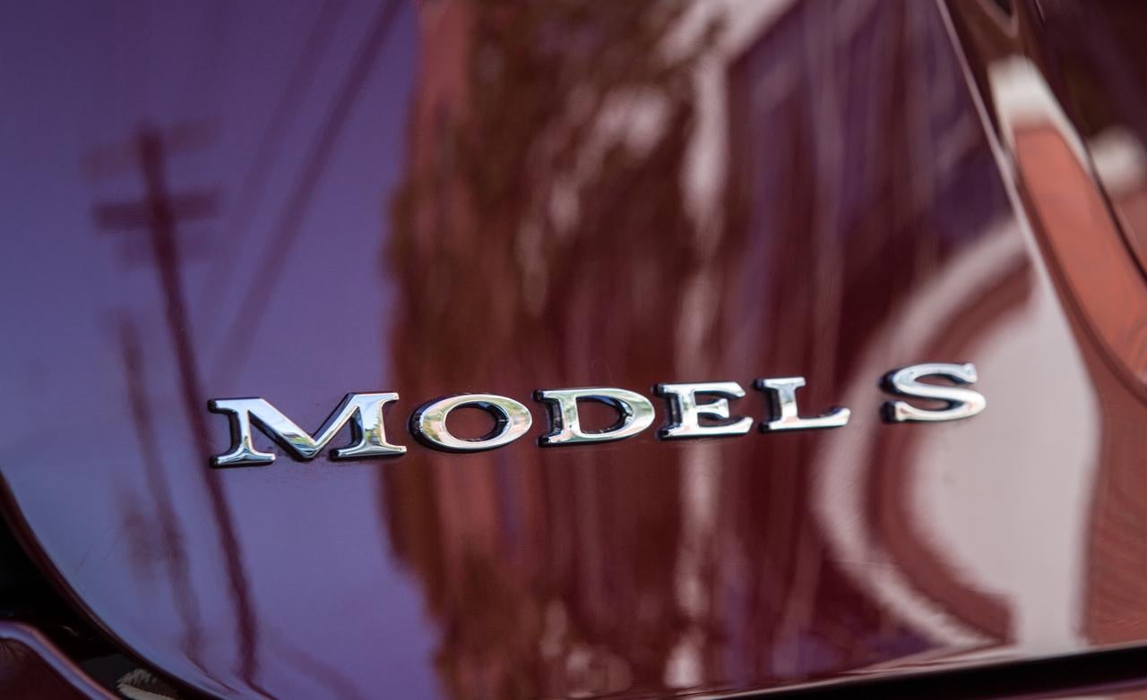
Could they have used a cheesier font? It looks like someone just pulled a random, stock serif font out of Word and said, "Here you go. Done." And I'm sorry, but it looks like "MODELS" and not Model S. Doing something to the typeface to distinguish the S component as being the identifier would have helped.
But really. That's my only gripe.
(finally got to ride in one this morning and oh my, I was not expecting what I experienced)
 Arch Duke Maxyenko, Shit Talk Extraordinaire
> Chairman Kaga
Arch Duke Maxyenko, Shit Talk Extraordinaire
> Chairman Kaga
06/03/2014 at 15:56 |
|
Could be worse.
Could be Comic Sans.
 HammerheadFistpunch
> Chairman Kaga
HammerheadFistpunch
> Chairman Kaga
06/03/2014 at 16:04 |
|
Surplus Oldsmobile lettering?
 MonkeePuzzle
> Chairman Kaga
MonkeePuzzle
> Chairman Kaga
06/03/2014 at 16:20 |
|
and now to see what happens when you rearrange them
http://www.ssynth.co.uk/~gay/cgi-bin/n…
|
Chairman Kaga
> MonkeePuzzle
06/03/2014 at 16:29 |
|
OM SLED.
Exactly.
|
Chairman Kaga
> HammerheadFistpunch
06/03/2014 at 16:32 |
|
It does have a certain old-world feel. My first reaction was one of those Wild West novelty fonts, even though it doesn't actually bear much resemblance.
|
MonkeePuzzle
> Chairman Kaga
06/03/2014 at 16:41 |
|
ohm sled woulda been better
|
Chairman Kaga
> MonkeePuzzle
06/03/2014 at 16:52 |
|
But close enough...
 Frank Grimes
> Chairman Kaga
Frank Grimes
> Chairman Kaga
06/03/2014 at 17:19 |
|
I dont know why I kinda like it. i guess because its such a modern design with modern tech to use a san serif font would be super cliche.
 JQJ213- Now With An Extra Cylinder!
> Arch Duke Maxyenko, Shit Talk Extraordinaire
JQJ213- Now With An Extra Cylinder!
> Arch Duke Maxyenko, Shit Talk Extraordinaire
06/03/2014 at 17:32 |
|
Confession: I liked Comic Sans. A lot. I used it before it mattered!
 cabarne4
> MonkeePuzzle
cabarne4
> MonkeePuzzle
06/03/2014 at 18:30 |
|
SOLD EM?
Personally, I'd just de-badge it. Asides from the badge, one of the absolute best looking cars on the road.